
Color grading mechanics and 4 proven rules that create breathtaking cinematic moods
Raw digital video is deliberately engineered to look flat, dull, and lifeless straight from the camera sensor. Unlocking its true narrative power requires understanding the optical physics and perceptual science that separate amateur adjustments from world-class cinematic polish.
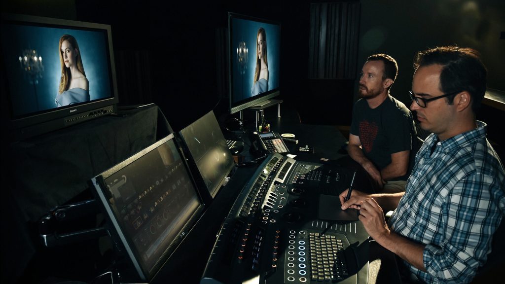
Mastering professional color grading mechanics separates amateur home video from the breathtaking, moody visual depth of world-class cinema. When an uncompressed cinema camera records a scene, the resulting raw footage often catches newcomers off guard. The image appears milky, muted, washed out, and utterly drained of emotion. That desaturated look is not a defect. Modern digital cinema sensors are intentionally engineered to capture scene-referred light logarithmically, preserving expansive highlight headroom and deep shadow detail without making subjective artistic choices on set.
Transforming this slate-gray digital negative into a visceral, evocative visual world is where the craft truly begins. Color grading is far more than slapping a trendy filter or arbitrary look-up table across an edit. It is an intricate discipline operating at the exact crossroads of mathematical color science, optical physics, and the biology of human perception. Every subtle twist of a lift wheel or adjustment to a tonal curve directly influences how an audience feels about a character, a space, or a passing moment.
Cinematographers and visual artists who spend decades in mastering suites know that emotional resonance cannot be generated by accident. By breaking down the technical foundations of how digital sensors record photons and how human retinas interpret hue, understanding these underlying color grading mechanics reveals why a flat LOG profile holds such astonishing latent potential.
The hidden physics behind digital negative transformation
Every digital image begins as physical light passing through glass elements and striking a photosensitive silicon array. The camera sensor records photons as linear voltage measurements. In pure linear light, double the number of photons means double the electrical value. However, human visual biology does not process illumination linearly. Our eyes are vastly more sensitive to delicate gradations in deep shadows and midtones than to slight luminance shifts in blinding sunlight.
To capture this biological dynamic range efficiently within digital bitstreams, camera manufacturers encode raw sensor data using logarithmic curves, such as Arri LogC, Sony S-Log3, or REDWideGamutRGB. A logarithmic encoding compresses highlights while dedicating the lion’s share of digital bit depth to lower-exposure registers. While this preserves up to fifteen or more stops of latitude, it leaves the uncorrected image looking severely lacking in contrast and chromatic vigor on a standard display.
Translating that wide dynamic range into a standardized display space requires rigorous color management. The industry standard Academy Color Encoding System developed by the Academy of Motion Picture Arts and Sciences provides an open, device-independent framework designed specifically to preserve photometric accuracy across diverse capture sensors and mastering monitors. Operating within a unified color space prevents rounding errors, digital posterization, and unnatural highlight clipping before creative styling even begins.
How human eyes perceive contrast and chromatic balance
Color grading does not occur inside a vacuum. It occurs entirely within the ocular system of the viewer. The human retina utilizes three types of cone photoreceptors tuned to short, medium, and long wavelengths of light, but the brain processes these inputs through opponent-process channels. We do not perceive red and green simultaneously in the same spatial point, nor do we perceive blue and yellow as overlapping sensations.
This neural architecture creates a powerful optical phenomenon known as simultaneous contrast. A neutral gray square placed against a warm amber background will appear perceptually cool, shifting toward cyan in the mind of the viewer. Conversely, that identical gray patch placed over an icy blue backdrop suddenly radiates warmth. Colorists manipulate this biological trick constantly, generating rich depth without ever forcing unnatural, garish tones onto the screen.

Furthermore, human eyes are relentless adaptation engines. Enter a room lit with warm tungsten lamps, and within seconds, a white sheet of paper that initially appeared orange will once again read as pure white. Digital cameras capture absolute chromaticity, but human consciousness constantly recalibrates toward a subjective neutral baseline. Balancing this physiological tension is the bedrock of establishing spatial continuity across consecutive shots.
Proven rules that define legendary visual storytelling
When colorists sit down in a dark room with a calibrated control surface, disciplined color grading mechanics dictate a strict order of operations. Bypassing foundational steps to jump immediately into creative saturation shifts almost universally produces an unstable, fractured grade that crumbles under varied viewing environments.
Anchoring luminance relationships before touching chromatic saturation
Luminance provides the foundational skeleton of any visual composition, while hue and saturation merely supply its clothing. Before altering tint or color temperature, the colorist must shape the tonal distribution across the waveform monitor. This involves mapping the black point, setting the midtone pivot through the gamma control, and establishing an organic highlight roll-off that gently compresses bright sky details rather than allowing them to clip hard against peak display limits.
If the tonal contrast ratio between a character’s face and the background scenery is poorly constructed, no degree of vibrant color styling can rescue the frame. Contrast directs the viewer’s gaze, establishes atmospheric depth, and defines spatial volume. By sculpting light through precise primary offset adjustments and tonal curves first, the image gains dimensional weight long before a single drop of stylistic hue is introduced.
Isolating spectral memory colors through strict vectorscope discipline
Certain elements in visual culture trigger immediate biological scrutiny from the audience. Chief among these are memory colors, which encompass familiar natural phenomena such as blue sky, rich foliage, and human skin. The human brain possesses an acute, evolutionary sensitivity to flesh tones. If a character’s skin turns unnaturally green, jaundiced yellow, or magenta, the audience experiences an immediate, subconscious sense of unease.
These delicate color grading mechanics require isolating the chrominance of human faces using qualifier masks or targeted hue-versus-hue curves to ensure skin aligns faithfully along the universal skin-tone axis on a vectorscope. Just as visceral sound relies on physical materials—much like the craft detailed in our guide on Foley sound design mechanics and 4 proven secrets that craft deeply immersive cinema—visual storytelling requires an equally disciplined biological anchor. Once memory colors are protected and verified, the rest of the environmental palette can be pushed toward radical stylistic extremes without shattering narrative immersion.
Leveraging complementary color splits without muddying midtone separation
The timeless allure of cinematic color splits, such as pairing teal shadows with warm amber skin tones, is grounded in subtractive color theory. By pushing opposing quadrants of the color wheel into different luminance tiers, the colorist builds apparent chromatic separation. The danger lies in heavy-handed cross-contamination, where aggressive color cast spills directly across midtones, turning faces muddy and turning dark clothing into muddy visual sludge.
Surgical colorists construct complementary splits by applying hue-over-luminance curves and secondary qualifiers. Shadows receive their chromatic cooling strictly below the low-mid threshold, while highlights retain warmth without burning into oversaturated neon clipping. Preserving an uncorrupted neutral core within the midtone values guarantees that costumes, set dressing, and natural skin remain distinct, three-dimensional, and authentic to the scene’s spatial geography.
Managing lookup tables with deliberate mathematical roll-off
Look-up tables, commonly known as LUTs, are mathematical matrices that re-map incoming RGB coordinates to designated output values. While creative 3D LUTs offer a convenient shortcut for previewing aesthetic concepts, treating them as blunt, end-all color solutions creates severe post-production bottlenecks. Because LUTs are rigid grids, extreme exposure shifts applied before an aggressive LUT can easily cause color banding, harsh quantization errors, and broken highlight gradients.
Sophisticated color grading mechanics treat 3D LUTs as final mathematical destination targets rather than corrective crutches. All balance adjustments, dynamic range recoveries, and shot-matching corrections must occur upstream in the node pipeline, feeding the lookup transform a clean, normalized signal. Furthermore, blending the key output of a look-up table or rebuilding its tonal curvature using native parametric curves maintains pristine mathematical floating-point precision across the entire image pipeline.
Common pitfalls that ruin post production color integrity
The most pervasive error in modern visual post-production is over-manipulation born from uncalibrated monitoring. Many creators grade footage on consumer-grade displays featuring dynamic contrast adjustments, factory oversaturation, or ambient room light reflections. Grading in an unchecked visual environment inevitably leads to overcompensating: pushing blacks far too deep to compensate for screen glare, or stripping out natural saturation because the computer monitor is exaggerating vibrance.
Failing to respect fundamental color grading mechanics frequently results in clipped luminance values, posterized shadows, and garish neon artifacts. Pushing secondary qualifier selections too aggressively creates harsh edge halos around subjects, while reckless global saturation destroys subtle gradations in fabrics and skin pores. High-end visual storytelling is fundamentally an exercise in aesthetic restraint; the best grades are those the audience never consciously analyzes, feeling the psychological atmosphere while remaining entirely lost inside the narrative world.
Cultivating an intuitive eye for cinematic atmosphere
Color grading mastery demands dual fluencies. An artist must read a waveform monitor, vectorscope, and CIE chromaticity diagram with clinical precision, yet assess the screen with the sensitivity of an impressionist painter. Setting up a standardized monitoring environment—featuring neutral gray walls, D65 calibrated reference illumination, and a clean, non-interfering viewing path—builds the optical baseline necessary to judge minute tonal shifts objectively.
Ultimately, mastering advanced color grading mechanics is not about chasing fleeting trends or applying one-click digital filters. It is about understanding how light communicates time of day, how color contrast evokes loneliness or intimacy, and how careful preservation of dynamic latitude honors the collaborative artistry of the director and cinematographer. When technical precision merges with narrative intent, rigorous color grading mechanics transform ordinary digital captures into lasting visual poetry.