Film color grading psychology and 4 proven rules that create unforgettable visual drama
Color in cinema is far more than an aesthetic skin; it is a neurological weapon that guides audience empathy and subconscious dread. Explore the science of tonal balance and four rules that define master visual grading.
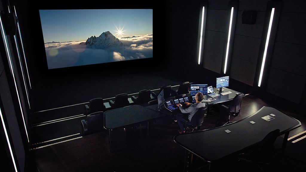
Mastering film color grading psychology transforms a technically proficient sequence into an unforgettable visceral journey that bypasses intellectual scrutiny to manipulate raw human emotion. Long before a viewer deciphers dialogue or analyzes narrative subtext, their optical system processes spectral wavelengths that trigger instant neurological and visceral responses. A subtle shift toward sickly yellow-green can induce immediate physical discomfort, while deep, desaturated slate blues can render an ordinary domestic living room agonizingly desolate. Moving pictures have never been mere mechanical documentations of reality; they are deliberate psychological manipulations engineered to evoke specific feelings.
Modern cinema often forgets this sacred optical contract. With modern digital cameras recording clean, flat digital log files, post-production teams face endless possibilities in the grading suite. Too often, however, this creative freedom degenerates into cosmetic vanity or hasty trend-chasing. Understanding how color functions as an active psychological stimulant separates amateur desktop colorists from legendary filmmakers who paint directly onto the viewer’s subconscious.
The Neurobiology Behind Cinematic Color Perception
Every single frame projected across a dark cinema theater engages an intricate biological dialogue between the human retina and the limbic system. At its core, film color grading psychology operates at the intersection of evolutionary survival instincts and neurological pattern recognition. The human eye relies on roughly one hundred and twenty million rods that detect raw luminance and six million cone photoreceptors calibrated to red, green, and blue light bands. Over hundreds of millennia, our ancestors relied on these specific sensors to detect vital environmental indicators, from the ripe crimson of safe berries to the foul chartreuse of putrefying meat or the cooling indigo of approaching dusk when predators awake.
When an experienced colorist adjusts digital tone curves, they are actively tapping into those ancient evolutionary survival circuits. Warm wavelengths featuring high optical energy, such as saturated reds and blistering ambers, trigger heightened sympathetic nervous system activity, elevating cortisol levels and nudging heart rates upward. This primal reaction explains why high-stakes chase sequences or claustrophobic basement interrogations feel so suffocating when bathed in oppressive, sodium-vapor yellows. In contrast, short blue wavelengths stimulate the parasympathetic nervous system, lowering blood pressure and cultivating contemplative silence or profound alienation. Color is biological code that dictates how an audience physically feels inside a scene.
The Great Fallacy of Look Up Tables and Digital Homogenization
The rise of digital workflows democratized cinematic post-production, but it also birthed a plague of creative monotony. Countless productions now rely heavily on pre-packaged Look Up Tables, commonly known as LUTs, hoping to purchase cinematic brilliance with a single desktop click. The ubiquitous orange-and-teal treatment that dominated studio multiplexes for decades represents the most flagrant abuse of this automated mindset. While founded on sound optical contrast principles, applying an identical technical preset across an entire feature film flattens dramatic nuance into generic visual wallpaper.
Narrative meaning requires bespoke chromatic development that shifts alongside dramatic tension. When visual cues betray established story patterns, human cognitive equilibrium stumbles. Unexpected shifts in reality provoke immediate mental friction; much like when unexpected economic shifts alter household planning, such as when the Social Security 2027 COLA Announcement Brings 4 Major Shockwaves for Retirees who must abruptly reconfigure their financial horizons, abrupt palette departures destabilize a viewer’s mental footing. When executed with surgical narrative precision, that visual whiplash produces jaw-dropping cinematic drama; when slapped on through an unthinking preset, it merely alienates the observer.
Human perception is astonishingly adept at identifying synthetic distortions within organic imagery. When a clumsy color grade forces an actor’s face into fluorescent orange while crushing ambient background shadows into muddy turquoise sludge, the brain senses dishonesty. The dramatic suspension of disbelief collapses not because the acting stumbled, but because the colorist’s heavy-handed grading choices severed the emotional connection between performer and audience.
Four Proven Rules That Shape Subconscious Audience Emotion
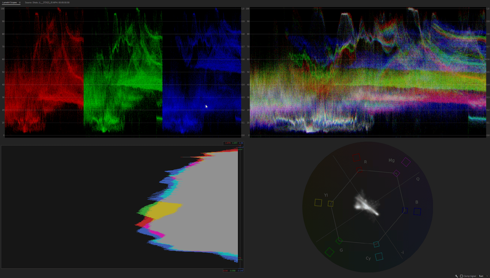
Transcending standard color correction demands an uncompromising aesthetic philosophy rooted in narrative architecture. This is where applied film color grading psychology governs every decision, ensuring that every shift in saturation, hue, and luminance serves the narrative arc rather than individual vanity.
Establish Chromatic Motifs Tied to Character Evolution
Color palettes must never remain static across a two-hour journey unless psychological stagnation is the story’s core thematic thesis. Master visual storytellers design chromatic progressions that evolve parallel to an ensemble’s moral trajectory. A protagonist might begin their odyssey bathed in gentle, low-contrast pastel tones that symbolize safety and emotional innocence. As tragedy compounds and ethical compromises multiply, the colorist systematically strips out delicate highlights, driving midtones into severe olive drabs or cold, unflinching steel greys.
This deliberate shift proves that film color grading psychology works best when colors track psychic transformations across screen time. By the climactic sequence, the character inhabits a harsh visual environment that reflects their inner ruin. If the visual aesthetic remains identical from the opening title to the closing credits, the audience receives conflicting emotional cues: the dialogue claims the character has transformed, but the eyes perceive an unchanged world. Aligning palette transitions with character evolution creates an overwhelming sense of dramatic inevitability.
Exploit Opponent Process Theory to Drive Visceral Conflict
During the nineteenth century, German physiologist Ewald Hering formulated opponent-process theory, establishing that human vision decodes spectral information through antagonistic pairs: red against green, blue against yellow, and black against white. In dramatic cinematic storytelling, this biological friction becomes an exceptionally potent tool. Staging conflicting narrative forces across opposing color spectrums creates immediate psychological tension without uttering a single line of exposition.
When an isolated protagonist draped in pale cyan shadows enters an opulent room illuminated by suffocating golden light, their vulnerability is instantly established. Deep dives into American Society of Cinematographers archival research demonstrate how pioneers of three-strip Technicolor meticulously balanced conflicting chemical dyes to generate pictorial depth without causing optical fatigue. Modern digital artists use these same foundational relationships to signal impending betrayal, conflicting loyalties, and existential danger directly through complementary color friction.
Sculpt Emotional Spatial Depth Through Split Toning Luminance
Amateur color grades frequently paint every luminance band with uniform color casts, tinting highlights, midtones, and blacks with the same blunt brush. Professional grading, by contrast, sculpts three-dimensional emotional atmosphere through deliberate split toning across discrete exposure ranges. By isolating the deepest shadows and nudging them toward frigid cobalts while keeping the midtones of an actor’s face warm and organic, a colorist produces immense narrative depth. The shadows whisper danger and mystery, yet the human being on screen remains deeply empathetic and touchable.
Inverting that optical relationship yields starkly different psychological results. Pushing warm, sickly ochres into crushed shadows while bathing skin highlights in clinical, sterile cyan creates a jarring, feverish ambiance evocative of madness or psychological fragmentation. This structural manipulation of luminance reinforces the reality that film color grading psychology manipulates perceived atmospheric volume. The viewer does not merely look at the room; they feel its stifling humidity, its toxic chill, and the emotional ghosts lingering in its unlit corners.
Manipulate Saturation Suppression to Weaponize Visual Epiphanies
Saturation represents the volume dial of optical emotion. Just as continuous, deafening shouting in an audio mix causes listener fatigue and neutralizes narrative tension, persistent visual hyper-saturation dulls an audience’s nervous system. The most memorable cinematic moments exploit ruthless chromatic discipline, holding vibrant primaries in reserve until a defining narrative breakthrough demands complete emotional release.
When an entire film unspools across desaturated slates, muted charcoals, and chalky earths, the viewer’s visual senses acclimatize to that austere baseline. When an uninhibited splash of rich crimson, a luminous emerald scarf, or a golden sunrise finally punches through the frame, the emotional impact lands like a physical thunderclap. The colorist has not simply dialed up a color; they have curated a transformative epiphany by rationing chromatic energy with calculated patience.
Why Mismatched Tonal Palettes Destroy Suspension of Disbelief
Color grading forms an invisible contract between the director and the viewer. When productions ignore film color grading psychology, audiences subconsciously detect the artificiality, breaking immersion immediately. This rupture rarely surfaces as technical terminology; the average moviegoer does not leave a theater complaining about clipped dynamic range, crushed log gammas, or incorrect gamut conversions. Instead, they simply remark that the narrative felt hollow, unconvincing, or emotionally vacant.
Visual dissonance strikes hardest when the chromatic grading contradicts the screenwriting. Drenching an agonizing tragedy in vibrant, saturated commercial advertising colors strips the actors’ sorrow of weight, rendering their pain synthetic and trivial. Similarly, smothering a buoyant, character-driven comedy under gloomy, desaturated Nordic-noir tones smothers the comedic timing under an unearned blanket of dread. The visual palette must act as a transparent emotional resonator for the writing and cinematography, never an egocentric distraction that undermines the narrative.
The Enduring Alchemy of the Master Colorist
Moving picture color grading is neither clinical laboratory science nor arbitrary artistic intuition. It is an enduring alchemy of optical physics, evolutionary human biology, and profound narrative empathy. Every adjustment made within a digital node structure represents a definitive judgment about how light interacts with the human heart. The colorist chooses what dark truths to swallow within the shadows, what fragile hopes to celebrate within radiant highlights, and what silent dramatic tensions to weave through the midtones.
As post-production technology hurtles forward into higher dynamic ranges, ultra-wide color spaces, and automated machine-learning tools, the core responsibility of the human storyteller remains unchanged. Faster hardware simply offers a wider palette of digital pigments; it cannot understand heartbreak, terror, or triumphant relief. Ultimately, applied film color grading psychology is not a cosmetic polish applied in post-production, but an indelible narrative language that carves deep emotional memories into the viewer’s subconscious long after the projector lamp extinguishes and the final credits roll.