Film Color Grading Mechanics and 4 Proven Rules to Craft Unforgettable Visual Storytelling
Color in cinema is far more than mere decoration; it is an invisible narrative engine operating directly on human perception. Discover the core mechanics of cinematic color grading and the four essential rules that define world-class visual storytelling.
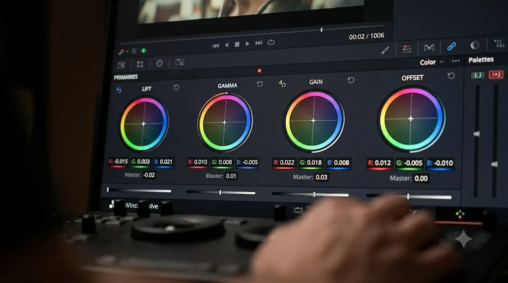
Mastering film color grading mechanics allows filmmakers to guide audience emotion, establish spatial geometry, and craft unforgettable visual narratives without speaking a single line of dialogue. Long before an actor utters a syllable or an orchestral swell signals rising tension, the tonal texture of a frame has already primed the viewer’s nervous system. Color sets the terms of engagement. It tells the human eye where to rest, what to fear, and when to grieve.
Yet, true cinematic color is neither arbitrary nor purely intuitive. It is an exacting discipline situated squarely at the crossroads of human optical biology, physical chemistry, and digital signal mathematics. When handled carelessly, digital manipulation produces plastic textures, severed gradients, and visually exhausted audiences. When executed with precision, color grading transforms flat sensor data into living, breathing theatrical atmosphere.
The Optical Evolution from Photochemical Baths to Color Wheels
To appreciate modern film color grading mechanics, one must understand the chemical ancestry of theatrical film stocks. In the analog era, color manipulation was fundamentally physical. Cinematographers altered looks through emulsion chemistry, exposure timing, and optical bath development. Laboratory technicians operated color timers, exposing intermediate negatives to filtered red, green, and blue light using mechanical printer lights calibrated in discrete numerical points.
A timer could shift the entire image warmer or cooler, denser or thinner, but they could not easily isolate an actor’s jacket from the wallpaper behind them without destructive physical masking. The digital intermediate revolution dismantled these physical constraints. Modern colorists work within vast mathematical color spaces where every pixel possesses independent coordinates across luminance, chrominance, and saturation matrices.
This shift from subtractive chemical dyes to additive digital matrices unlocked miraculous creative freedom. However, it also introduced subtle visual traps. Without the natural organic soft-clipping of chemical silver halides, digital sensors can render abrupt highlight roll-offs and sterile, clinical shadows. Mastering the digital color suite requires honoring the organic physics of physical light while wielding mathematical transforms with surgical restraint.
The Biological Architecture of Human Color Perception
At a biological level, film color grading mechanics exploits how human photoreceptors interpret simultaneous contrast. Our eyes do not measure absolute wavelengths in isolation. Instead, roughly six million retinal cones and over one hundred million rods continuously measure differences between adjacent patches of light. The human visual cortex operates on opponent-process channels, assessing luminance, red versus green, and blue versus yellow.
Because the brain continuously recalibrates white balance based on ambient context—a phenomenon known as chromatic adaptation—color perception is relative. A neutral gray swatch placed against a saturated cyan background immediately appears warm and reddish to the viewer. Colorists manipulate this biological quirk to evoke profound physical sensations.
Cooling shadow values while gently preserving amber highlights forces the viewer to subconsciously perceive biting winter cold punctuated by fragile warmth. Pushing midtones toward sickly yellow-greens stimulates a primal visceral discomfort before the plot reveals an impending tragedy. The grading suite does not simply alter a digital image; it alters the perceptual baseline of the human brain.
Four Proven Principles for Mastering Theatrical Color Harmony
Translating theoretical color theory into production environments requires disciplined film color grading mechanics that safeguard image data while evoking raw dramatic tension. Professional colorists do not rely on haphazard preset filters or heavy-handed stylistic looks applied blindly across an entire timeline. Instead, they build looks methodically from clean exposure fundamentals upward through these four architectural pillars.
Establish Strict Luminance Hygiene and Black Point Integrity
Every compelling visual grade begins with light distribution before a single drop of chromatic saturation is introduced. Luminance carries over seventy percent of the spatial information processed by the human eye. If the tonal contrast curve is fractured, the entire grade collapses into muddy incoherence.
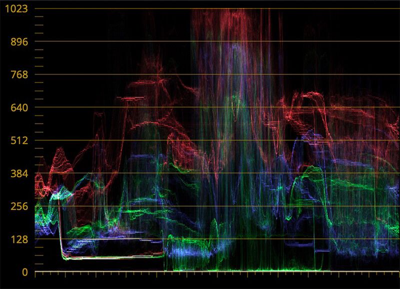
Clean luminance hygiene requires establishing an intentional, uncompromised black point. Crushing shadow detail into dead, absolute zero obliterates environmental texture and causes severe spatial flattening. Conversely, floating shadows too high washes out the dynamic snap of the frame, robbing scenes of dramatic weight. Top-tier colorists sculpt the lower quartile of the waveform monitor, pinning true black just above clipping while preserving subtle micro-contrast within deep textile folds and distant architectural shadows.
Protect Authentic Skin Tone Radiance Along the Vectorscope Vector
Human beings are genetically programmed to scrutinize other human faces with microscopic precision. Audiences will willingly accept hyper-stylized alien landscapes, radioactive green skies, or cobalt nocturnal streets, but they instantly reject unnatural skin tones. The moment an actor’s face displays a green tinge or oversaturated magenta splotches, emotional immersion shatters.
Regardless of an actor’s genetic heritage or melanin concentration, human blood and dermal scattering align along a remarkably narrow trajectory on the vectorscope color monitor: the universal skin tone line. Professional workflows isolate and protect this precise chromatic corridor. Even within aggressively stylized palettes, master artists build secondary qualifiers or parallel color nodes that shield facial hues, keeping them grounded in believable physiological truth while the surrounding environment leans into dramatic stylization.
Harness Perceptual Opponency to Create Visual Depth
Cinematic images exist on a flat, two-dimensional screen. To create the illusion of three-dimensional volume, colorists exploit the natural phenomenon of chromostereopsis, wherein warm wavelengths advance toward the viewer while cool wavelengths recede into the background.
By splitting the color balance across distinct tonal bands—cooling the shadows and warming the key highlights—colorists build separation between foreground subjects and atmospheric background environments. This technique cannot be achieved by merely dragging color lift and gain wheels in arbitrary directions. It requires carving out clean midtone transitions so colors blend seamlessly through the roll-off rather than clashing along hard digital edges. True spatial depth emerges when color contrast reinforces the natural illumination designed by the cinematographer on set.
Build Temporal Consistency Across Complex Lighting Transitions
A brilliant single still frame does not equal a cinematic color grade. Cinema is art through time. A sequence filmed over three distinct days under shifting cloud cover, changing sun angles, and fluctuating interior practical bulbs must flow across the edit as a continuous visual breath.
Maintaining temporal consistency demands microscopic attention to relative exposure shifts and chromatic drift between consecutive cuts. If an actor turns their head and their cheek highlight jumps two stops or drifts toward yellow from one angle to the next, the cut jars the viewer’s subconscious focus. Professional timing prioritizes shot-to-shot match over individual frame perfection, smoothing out sensor disparities and natural light variations until the entire sequence breathes with a singular narrative rhythm.
Balancing Contrast Ratios Against Brutal Dynamic Compression
Modern digital cameras capture astonishing dynamic ranges, frequently spanning fifteen or sixteen stops of light from the deepest shadows to searing specular highlights. Displaying this massive breadth of sensor information on consumer screens presents a formidable engineering challenge. Without meticulous tone-mapping, compressed dynamic range produces unappealing digital clipping and harsh banding artifacts across subtle sky gradients.
Colorists operate in highly standardized transformation environments, such as the Academy Color Encoding System standards developed by the Science and Technology Council, to preserve full mathematical color gamuts throughout the pipeline. Much like financial risk managers who calibrate volatile exposures through Options Delta Hedging Mechanics and 4 Proven Rules to Defeat Ruinous Market Volatility, modern digital colorists rely on rigorous film color grading mechanics to manage high-dynamic-range variance across erratic shooting conditions.
They balance highlight roll-off curves through logarithmic transformations rather than crude linear gain adjustments. This ensures that a blazing tungsten lamp or an afternoon sun flare dissolves smoothly into white with delicate chromatic fringing, mimicking the organic density curves of historical photographic film.
The Invisible Science of Subconscious Emotional Resonance
Ultimately, the finest film color grading mechanics operate below the threshold of conscious audience awareness. When viewers leave a theater discussing the color palette instead of the characters, the story, or the emotional devastation of the final act, the visual team has overstepped its bounds. Stylization must always serve the dramatic engine.
A bleak existential interrogation does not simply demand desaturation; it requires the deliberate suppression of high-frequency chromatic distractions to force the audience to confront raw facial micro-expressions. A nostalgic period drama does not require an artificial sepia tint; it thrives on gentle halation around highlights, a mellowing of harsh cyan frequencies, and a gentle lift in the lower midtones that mimics the slower chemical response of vintage lenses.
By harmonizing the physical properties of display hardware, the neurological quirks of human vision, and the disciplined execution of luminance balance, colorists construct worlds that linger long after the final credits roll. Color grading is not the final decorative varnish brushed onto a finished film. It is the silent, beating heart of visual storytelling itself.